
Your call to action can make or break the success of your content marketing. And really, that’s a no-brainer – how can you expect consistent conversions when you don’t effectively tell potential customers to take action? But despite this, 70% of small business websites lack a call to action, and if you fall into this category, lucky for you, you’re in the right place. In this blog, we will show you how to write a call to action the right way while looking at tried and tested call to action examples that are likely to guarantee results. Let’s get into it.
What is a CTA?
Before we dive in, let’s take a look at what a call to action actually is. A call to action (CTA) is the part of a webpage, advert, social media post or any other piece of content that encourages the audience to do something. From selling products to newsletter sign-ups, a CTA can drive a variety of different actions depending on the overall goal of your content.
Why is it important?
You can think of a call to action as a signpost. When written well and presented clearly, they should point potential customers in the right direction – usually towards investment in your brand. Your conversion rate will increase by over 120% if a CTA is written within the content. They’re small but mighty and absolutely crucial – here are three reasons why:
- They remove confusion from decision-making. Just like the perfectly placed road sign showing you exactly where you need to go, CTA’s make the user journey precise and clear.
- We covered this already, but they increase your audience and sales. You can utilise the call to action to achieve your content marketing goals. Ask customers to follow you on social media, learn more on a blog post or buy that one product they need. Think of your CTAs as a perfect tool for persuasion.
- They determine the needs of potential customers. By including a crystal-clear CTA, your audience won’t have any squabbles figuring out what your content is about. Instead, your content will build interest and excitement; they want to dig deeper and discover more. Or, if you find your content has the opposite effect, it may be a sign to return to the drawing board and revise your buyer personas.
The different types of CTA
CTA’s don’t only exist on your website. Whenever you create a piece of content, you should include a call to action, from webpage buttons and anchor text in blog posts to links in your email and text in social media captions. Each type will present itself a little differently, but they should all follow the same rules and work towards the same goal – conversions. Your call to action should reflect your brand’s personality and be written in your tone of voice. If your brand is cheeky or witty, this can be transferred into a persuasive, enticing call-to-action copy.
How to write a CTA
Writing a call to action isn’t as easy as it seems. Yes, it may only be a few words, but those words must pack a punch. Your website’s CTA will be read by 90% of people who look at your website so getting it right is essential if you want to see results. Here are five tips to help you write a killer call to action.
- Use action words: Just as it’s written on the tin, action words let your customers know the action you would like them to take. Common examples include join, subscribe, shop, click here, read this and contact us.
- Provide value: Value makes your CTA’s irresistible; your customers won’t be able to resist clicking. The most common value-adding buzzword is ‘free’, but great deals and hard-to-beat discounts will work too. This is a core consideration when learning how to write a call to action.
- Spark curiosity: Have you ever been on a website, and a box pops up with a game-show style wheel where you can enter your email and spin to win an exclusive offer? Curiosity is tempting, and customers love to have a little fun. Provide your audience with both to maximise conversions – but make sure there’s some value to the customer at the end of it.
- FOMO: People hate missing out – it’s in our nature. We love exclusivity. Add an element of time dependency to your CTA to spark urgency. If a customer is interested, they won’t want to wait and fear missing out.
- Test your CTAs: With any area of content marketing, we always recommend testing. Use A/B testing to work out what your customers respond to the most. There will always be an element of trial and error, but by following the above tips, you’ll be off to a good start.
You need to consider the design
The design of your CTAs will depend on where you are using them. CTAs in social media captions or printed advertising aren’t interactive. But on your website, there are two things to consider.
- Smart CTAs perform 202% better. People are experiencing more and more personalisation online and smart CTAs change based on location or whether a user has visited the site before. A personalised user experience is guaranteed to get your audience to pay attention; they’ll feel listened to and thought about and, thus, are more likely to convert.
- Making CTAs that look like buttons can improve the clickthrough rate by 45%, according to CopyBlogger. By including a clear button, clicking will be irresistible. Reducing the clutter around your button will benefit the conversion rate too.
Stand-out call to action examples
Every sign-up, subscription or product you’ve purchased online will have had some influence from a compelling call to action. And we’ve told you about our best advice for writing CTAs effectively, but what does this actually look like? Here are ten of our favourite CTA examples.
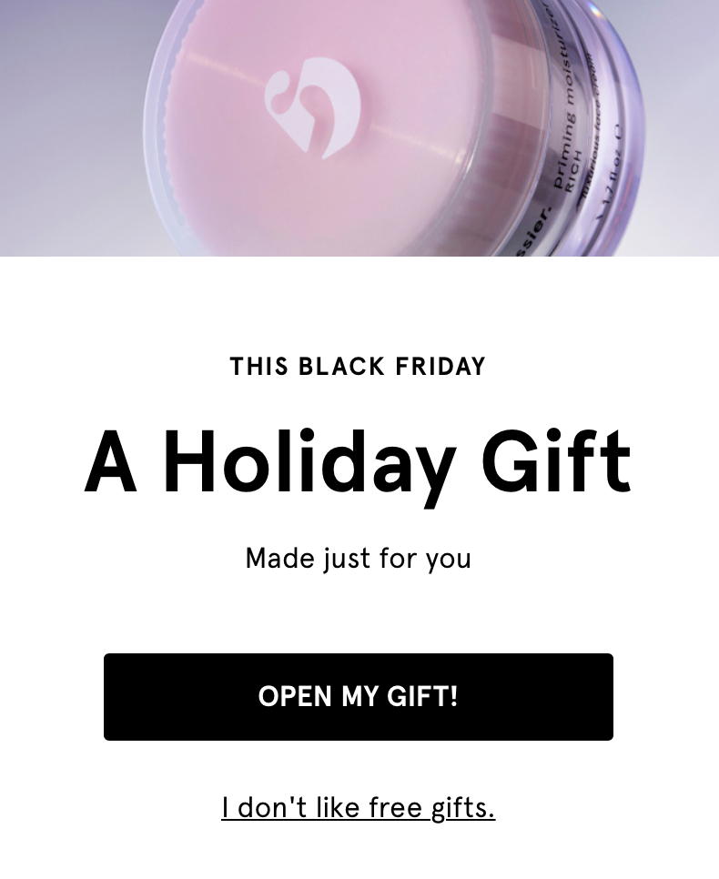
- Glossier: This cosmetics brand knows how to win its audience and encourage conversions with this tempting CTA. It knows that visitors browsing their website homepage may already be doing so with intent; they’re likely to have a purchase in mind. Therefore, by offering a free gift, the brand is likely to seal the deal. And to be even more persuasive, this nifty pop-up could only be closed by clicking the button or the link that says: “I don’t like free gifts” – and who doesn’t like free gifts?
- Netflix: These days, nearly everyone has access to a Netflix account. It’s a night-time staple for many households. But the price of Netflix’s subscription services has increased recently, contributing to a dramatic decline in users this year. So what does the brand do? They advertise a cheaper-than-ever plan to entice users back onto their platform. Proudly placed at the top of every website page, the banner shouts about the new £4.99 service offering – a tempting click for existing or new users. The blue ‘learn more’ anchor and arrow stands out amongst the other red, black and white design features, drawing the user’s eyes to exactly where Netflix want you to go. How can you resist such a cheap deal? This is a call to action example that uses price to encourage click-through.

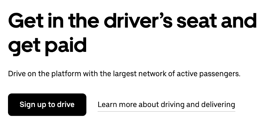
- Uber: The job market can be tricky to navigate, but Uber’s job offerings are no-nonsense and very straightforward. This CTA shows how easy it is to sign up and start earning money. Little information is provided on the homepage banner, as a handy clickthrough link is found next to the banner’s main button. Even though the information is accessible, the compelling headline encourages sign-ups straight away – a case of sign up now, get paid and then worrying about the small print later.
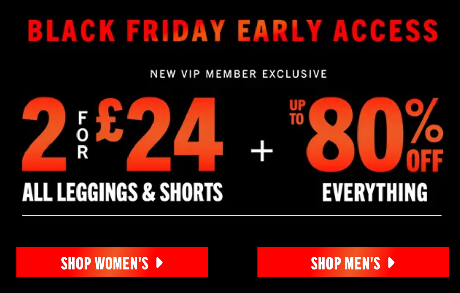
- Fabletics: As customers, we love exclusivity because we absolutely hate missing out. Fabletics’ VIP Member’s club is enough to appeal to anyone looking to bag a brilliant deal. Both offers are an absolute bargain, and the big, red buttons are waiting to be clicked. However, you have to be a member to make the most of these deals, so the fitness wear brand hopes to tick both conversions off the list with this powerful call to action example.
- Spotify: How many times have you signed up for a free trial and completely forgotten to cancel the subscription before the first payment is taken? We’ve all been there. But Spotify’s service offering of a free trial with absolutely no strings attached is ideal. This CTA tells you precisely what to expect – unlimited songs with occasional ads with no credit card needed. There are no hidden costs and no surprises, and you can sign up for free by clicking the standout button in the web page’s footer.

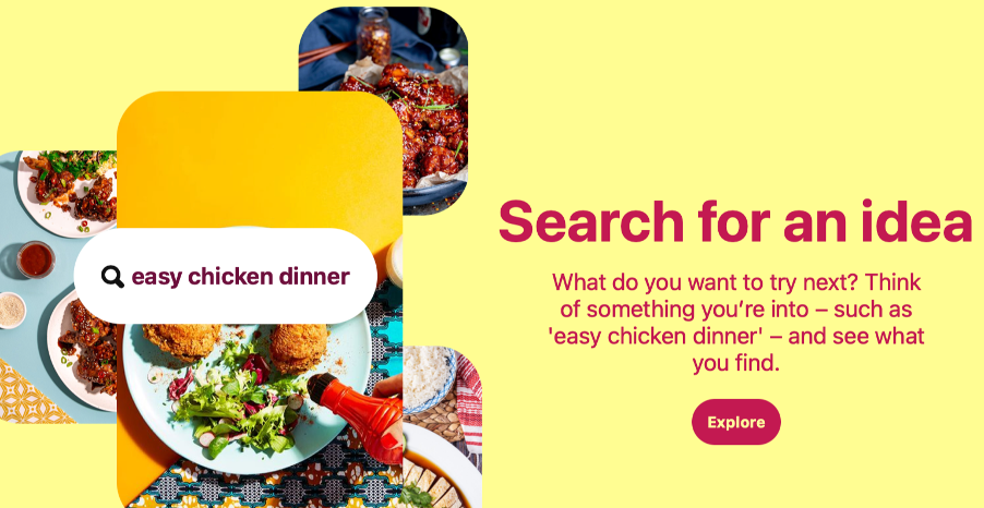
- Pinterest: The hub for ideas and inspiration, Pinterest shares just how easy it is to use their platform. By simply searching for an idea, the online world is your oyster by simply clicking the explore button. A simple sign-up will follow the click, and then you’ll be set to start searching, and Pinterest will have gained another user on their site.
- Boots: Great at advertising their best sales and deals to their users, Boot’s demanding call to action often accompanies limited and time-restrictive offers. Formatted in bold buttons, this ‘shop now’ call to action brings a sense of urgency, encouraging potential customers to make the most of the money off before time runs out. We hate to miss out on a great bargain, and the high street chain knows exactly how to play the game.

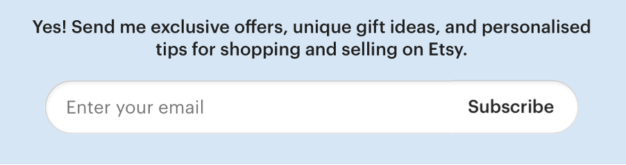
- Etsy: An email sign-up that does what it says on the tin. Etsy is upfront with potential subscribers, and users aren’t left wondering: “what will they send me?”. The promise of exclusive offers is also tempting, and a personalised experience is guaranteed to win a lot of users over. Etsy position its email marketing as something written for the customer with advice and tips to improve their shopping experience instead of a hard sell that is less likely to do wonders for their conversions. Being personal and helpful is key here.
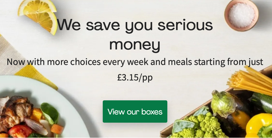
- Hello Fresh: Hello Fresh, the recipe box delivery service, claims to save you serious money, stress and time by delivering meal kits to your door every week. With flexible frequencies, users can choose from a wide range of meals for just £3.15 per person per meal. This helpful price breakdown is less daunting than the overall subscription fee, so users can feel they are getting a better deal. At this stage, the banner and call to action give little away, so the ‘view our boxes’ button is a very enticing click for curious customers. You begin the registration process by clicking on the link and are given a £19.99 off deal to continue. The CTA and exclusive offers make this an excellent conversion maker and a tricky deal to refuse. It’s a call to action example that sparks the reader’s curiosity.
- Big Star Copywriting: Spark curiosity and get your customers thinking about life with a helping hand from your product or services. If, even after reading this blog, you still need a helping hand with your call to action crafting and copywriting, we can help!
Every authority on online marketing agrees: if you want better results, write quality content – including good CTAs. And quality is exactly what we’re about. From regular blogging and social media content to web copy and product descriptions, we can deliver all the words you need quickly, skilfully and cost-effectively. To work with us, fill out the form, and we will be in touch.